
Full Site Redesign
The Eastside Paddle Club website was redesigned with a focus on SEO optimization and an improved user experience to drive growth and engagement. The new site architecture and navigation made it easier for users to book courts, explore events, and join memberships—resulting in higher conversion rates and improved retention. By collaborating with an SEO specialist, the redesign enhanced site performance, boosted search visibility, and ultimately increased revenue through greater traffic and membership sign-ups.
Role:
Lead UX/UI Designer
Duration:
4 weeks


Project Overview
Problem:
Users of Eastside Paddle Club’s website — including members, prospective members, and event participants — struggled to find essential information such as court reservations, open play registration, and membership details. The single-page layout lacked clear navigation and SEO optimization, causing frustration for users and limiting online visibility. This negatively impacted membership sales, visitor court bookings, and event registrations, ultimately reducing opportunities for revenue growth.
Solution:
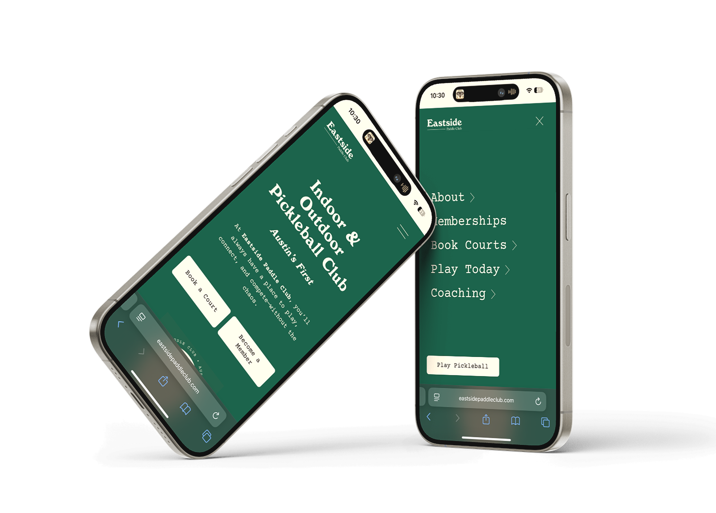
Delivered a fully responsive, multi-page redesign featuring intuitive navigation, a clear content hierarchy, and SEO-optimized pages. The updated structure streamlined the user journey and improved online visibility, enabling quick access to bookings, events, and membership information — ultimately driving higher engagement and increased revenue.
1.0 Defining the User & User Story
Persona 1 — Potential Member (Alexa Rivera)
Age: 32
Occupation: Software Engineer
Location: Austin, TX
Pickleball Level: Beginner
Background: Alex recently discovered pickleball through friends and is curious about joining a club. He’s never played at Eastside Paddle Club and wants to explore membership options, pricing, and how to get started.
Goals & Needs:
Easily understand membership types and pricing.
Find beginner-friendly events or open play times.
Have a simple way to sign up or get in touch for questions.
Pain Points:
Struggles to find clear info online when clubs have limited or cluttered websites.
Feels unsure about how to register or what the membership includes.
Wants confidence that the club is organized and welcoming before committing.
Behavior:
Researches clubs online before visiting.
Values clear navigation, FAQs, and visuals that show the vibe of the community.
Persona 2 — Existing Member (Emily Chen)
Age: 28
Occupation: Marketing Manager
Location: Austin, TX Pickleball
Level: Intermediate (3.0 DUPR)
Background:
Emily plays pickleball multiple times a week and is an active member of the club. She loves attending open play sessions and social events but values efficiency when managing her schedule.
Goals & Needs:
Quickly reserve courts and register for open play.
Access an events calendar with details and registration links.
Navigate seamlessly on mobile devices.
Pain Points:
The previous website was time-consuming to navigate with excessive scrolling.
Sometimes missed sign-ups due to unclear registration flows.
Behavior:
Regularly checks the site from her phone for availability and events.
Prefers simple, quick access to booking and registration.
Persona 1 User Story :
As a potential member, I want clear, easily accessible information about membership plans, pricing, and beginner-friendly events, so that I can confidently decide if the club fits my needs and sign up without confusion.
Persona 2 User Story:
As an existing member, I want an intuitive, responsive website that allows me to quickly book courts and register for events, so that I can that I can utilize my membership and easily participate in pickleball games without wasting time navigating the site.
2.0 Addressing the Problems
Lack of clear navigation —> Restructure Site Map & Hierarchy

Lack of clear membership & court booking information —> Provide clear, easily accessible facility information

Lack of online presence —>
Improve SEO

Site Map Redesign
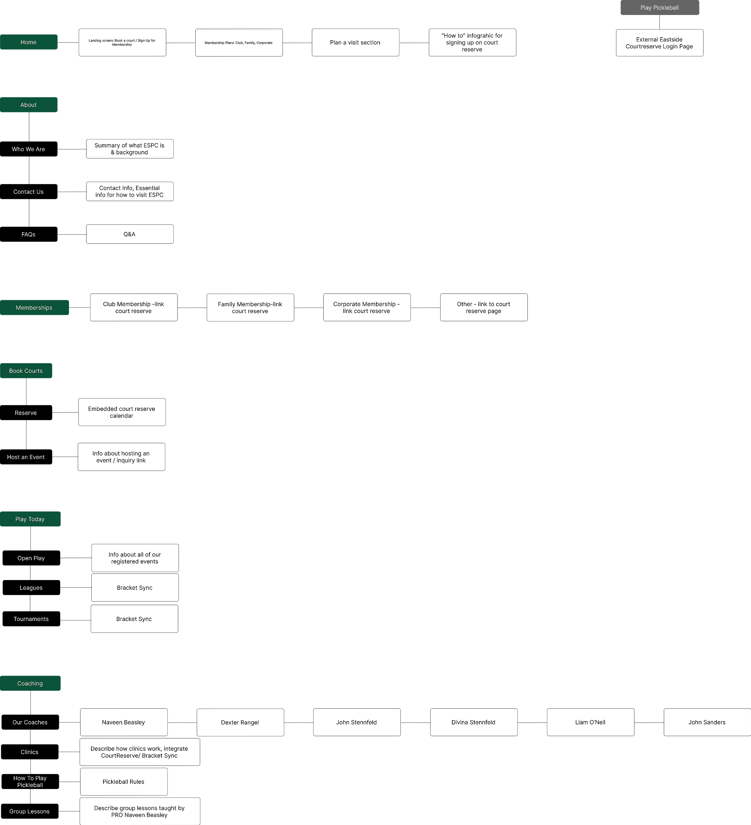
Main Navigation

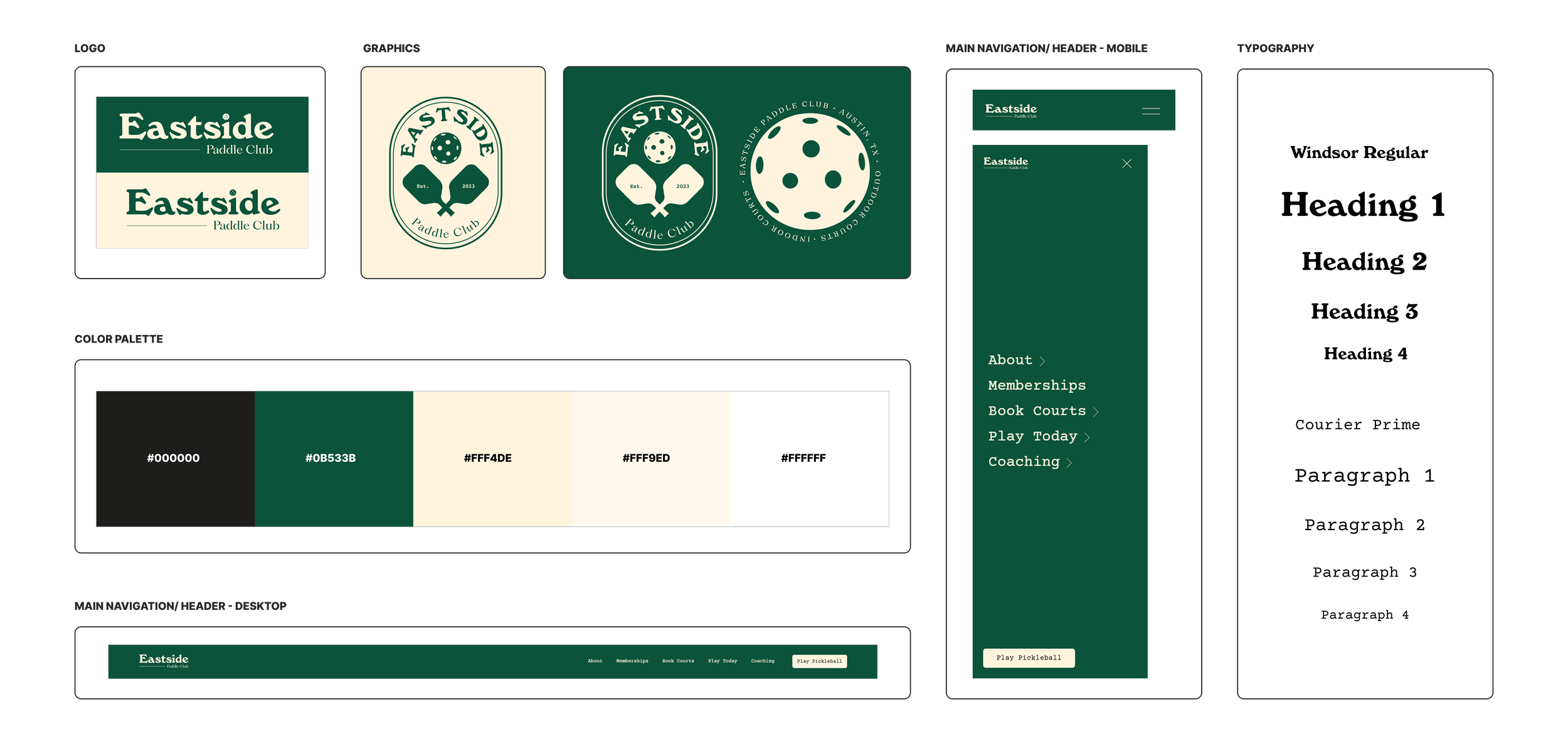
Style Guide
Original Site
Redesigned Site
Conclusion
Key Outcomes
Transformed a fragmented website experience into a clear, intuitive user journey centered around how members actually engage with the club.
Reorganized navigation and content hierarchy, making it easier for users to find court reservations, memberships, tournaments, and club information.
Reduced friction throughout the user experience by simplifying pathways to high-value actions and minimizing unnecessary clicks.
Improved mobile usability to better support the club's growing audience of on-the-go users.
Created a more cohesive visual and brand experience that reflected the energy, professionalism, and community-driven culture of Eastside Paddle Club.
Increased visibility of key offerings through strategic placement of calls-to-action and improved content organization.
Designed a scalable website structure that allows the club to easily promote new events, programs, and initiatives as the business continues to grow.
Strengthened trust and credibility with prospective members by replacing an outdated experience with a polished, modern digital presence.
Aligned user needs with business goals, helping create a seamless path from discovery to engagement.
Contributed to the club's continued growth by creating a website that not only informs users, but actively supports membership acquisition, event participation, and long-term community engagement.
Reflection
This project reinforced the importance of designing beyond aesthetics. While visual improvements helped modernize the brand, the greatest impact came from rethinking the site's structure and user flows. By focusing on how members navigate, discover information, and take action, the redesign became more than a website refresh—it became a tool that supports both user success and business growth.